Rise Up for Youth
How to increase traffic and bring awareness to the cause?
ROLE
UX/UI Designer, Researcher
TOOLS
Sketch, InVision, Optimal Workshop
YEAR
Launched February 2019
Overview
Rise Up for Youth is an organization that strives to inspire and motivate the youth of Kansas to unlock their full potential. Through education, mentoring and empowerment, Rise Up for Youth provides young people with support to cope with difficulties in life and to succeed in adulthood. Currently operating in five high schools, Rise Up for Youth wants to continue reaching out to other schools in Wichita and provide their services to the community. They felt that their current website was outdated and wanted something more modern to help spread their mission.
Challenge
I needed to ensure that my design is informative for multiple target users— contributors, parents, students and volunteers. Also, since this project was done remotely, I had to make sure there was clear communication between the Executive Director and I in order to achieve our goals.
Research
WHO ARE THE USERS & WHAT WAS THE CURRENT STATE?
Before I could start designing on Sketch, I needed to understand the users who visit the website and the current state. I found that majority of the users are contributors and volunteers. I also reached out to a couple of volunteer contacts to discuss with them what they would hope to see when applying for a volunteer position.
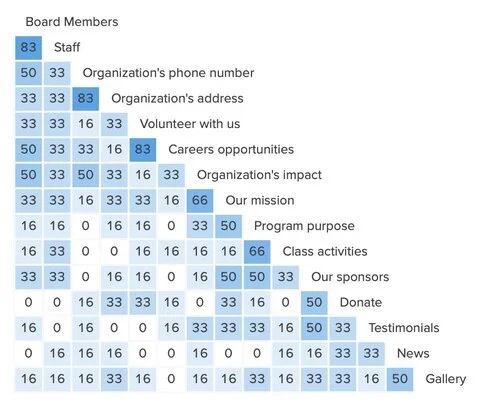
I was able to get the website’s analytics to get a better idea of what pages were visited the most by users. The analytics showed that the most viewed page was a news page that didn’t provide information on the youth programs. The lack of information structure could be a cause of users being directed to an unexpected page. I decided to conduct a card sort test to determine an optimal way to restructure the navigation. Using a software like Optimal Workshop, I was able to get a similarity matrix to help start with navigation re-structuring.
The diagram indicates the percentage of users who associated two cards with each other during the card sort.
With Rise Up for Youth’s goal in mind, I conducted a website content audit to identify the quality of the content and how it tries to achieve it. From the audit I was able to identify 3 main factors affecting the quality of the website:
Inconsistent copywriting can negatively affect the voice of the organization
A page of text without visual aids can slow down information processing
Navigation design lacks clarity and cues for the user
Ideate
SKETCHES
I was able to sketch up some designs based off the recommendations I suggested from the audit. Since the goal of the project was to provide information about the services Rise Up for Youth offered and opportunities to support, I made sure to emphasize those aspects through CTAs.
Sketches for Homepage, About and Programs pages.
Final Design
I created mockups of different pages of the site as deliverables to give the client a visual understanding of the recommendations I have suggested. Below are some of the screens of the website, with the old designs on the left and the new revamps on the right.
HOME PAGE
ABOUT PAGE
PROGRAM: SISTERHOOD
Reflections
RESULTS
Rise Up for Youth’s Executive Director and Board President were extremely satisfied with my proposed solution and implemented it into their current website. What I would have done differently if I was located in Wichita would be to speak to the students and volunteers and understand their perspectives of Rise Up for Youth.
Visit Rise Up for Youth to see the designs in action!


