Improving the user experience for an online senior care directory
A comprehensive analysis on redesigning a web page
CATEGORY
UX Design
TOOLS
Sketch, InVision
TIMELINE
October 2019 (6 days)
Overview
I reworked an existing webpage aimed at family caregivers of older adults. My redesign incorporated various resources offered by Caring.com, such as connecting users with Family Advisors, articles, tools, and directories for senior living options.
Challenge
The task at hand was to enhance the user experience on Caring.com's Assisted Living page and increase conversions. To achieve this goal, I drew on various resources provided by Caring.com and aimed to optimize the page for user acquisition. As part of the project, I created detailed design mockups and also documented the design process.
Research
WHAT ARE THE NEEDS, GOALS, AND CHALLENGES?
Before beginning the redesign of the Assisted Living page, I had to take into account the needs, goals, and challenges of both the users and the business. Caring provided me with information on the primary audience of the site, which were caregivers of family members, as well as secondary audiences of internet-savvy and concerned friends.
The main goal of these users when visiting the site is to research senior living and care options for their loved ones, and to find reputable communities in their surrounding area. The primary concern for users is that their loved one can no longer care for themselves, and they need to find a solution that fits both their financial and family needs. The business goal for the Assisted Living page is to drive macro conversions, which are usually achieved through form fills or phone calls to Caring's team of Family Advisors.
With these information I could understand user needs and goals, and tailor my design to help achieve the business goals.
WHO ARE THE USERS?
To ensure that my redesign of the Assisted Living page met the needs of the users, I conducted user research within the time constraints I had. This included reaching out to three individuals with different levels of caretaking experience: two beginner caretakers and one experienced caretaker with 5+ years of experience. I also did additional supplementary research by visiting online forums and discussion boards to gain a variety of perspectives on caretaking.
Through this research, I was able to gather insights such as:
“Loved one may feel or have certain views on how they want to be cared for”
“Biggest challenge is when your care is challenged by the person you’re providing care for”
“Dealing with a person under care is exhausting, makes me feel tired both emotionally and physically”
These insights helped me understand the emotional and physical tolls of caretaking, as well as the challenges that caregivers face when their care is rejected or challenged. With these insights I could design for user needs and goals, and ensure that my design helps in the difficulties of caretaking emotionally and physically.
WHAT IS THE CURRENT STATE?
To improve the usability of the Assisted Living page, I conducted mini usability sessions and gathered feedback from interviewees. Though a content audit, I applied what I learned from the users to evaluate the content on the page, its purpose and its layout. This helped to understand how users interact with the current version of the page, and identify any usability issues or areas for improvement for the redesign process.
HYPOTHESES AND ASSUMPTIONS
From the feedback I received during usability sessions, I was able to identify three key issues and formulate hypotheses for potential solutions:
Caretakers may become overwhelmed by a large amount of information, particularly first-time caretakers.
By presenting the information in an organized and easy-to-digest format, visitors will be more likely to read all of the content, resulting in an increase in page views and traffic duration.
Caretakers may have concerns about not knowing if they are making the right choices when looking for living options for their loved ones.
By providing assurance and guidance to users, they will feel confident in their decision-making and be likely to use the resources providing on the site, resulting in an increase in user acquisition
Caretakers want to make sure that the living options they choose for their loved ones meet their specific needs.
By providing more user control and customization, they will be able to find the best facility for their loved one and themselves, resulting in a solution that addresses their financial worries.
Ideate
SKETCHES
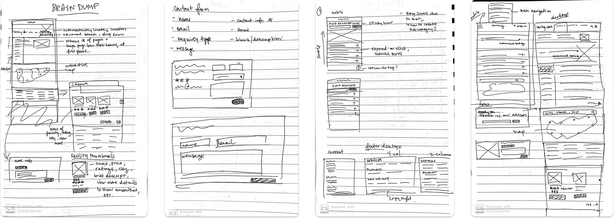
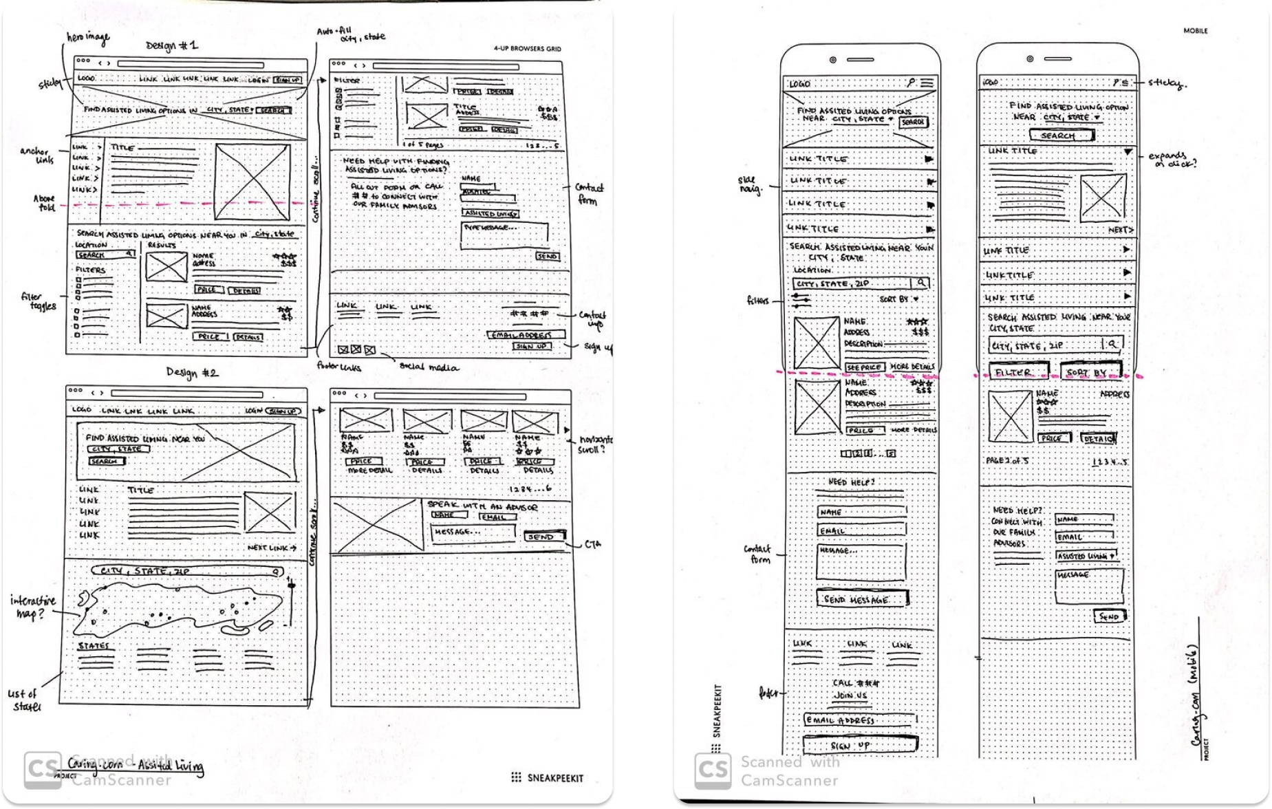
My redesign process began by creating a desktop-first design, where I laid out all the relevant content and ensured that it was displayed properly on larger screens. I also provided a mobile responsive design, ensuring that users would have a consistent experience across different device dimensions.
Sketches are rough and hand-drawn, with notes and annotations, helping me to quickly experiment with different layouts and ideas, and to easily communicate my design decisions.
Proposed Solution
I wanted the redesign to be an improvement and not a complete change, so to avoid a learning curve for previous visitors, using the brand’s components will help maintain familiarity and consistency.
The following showcases the before and after of my redesign, along with explanations for my design choices:
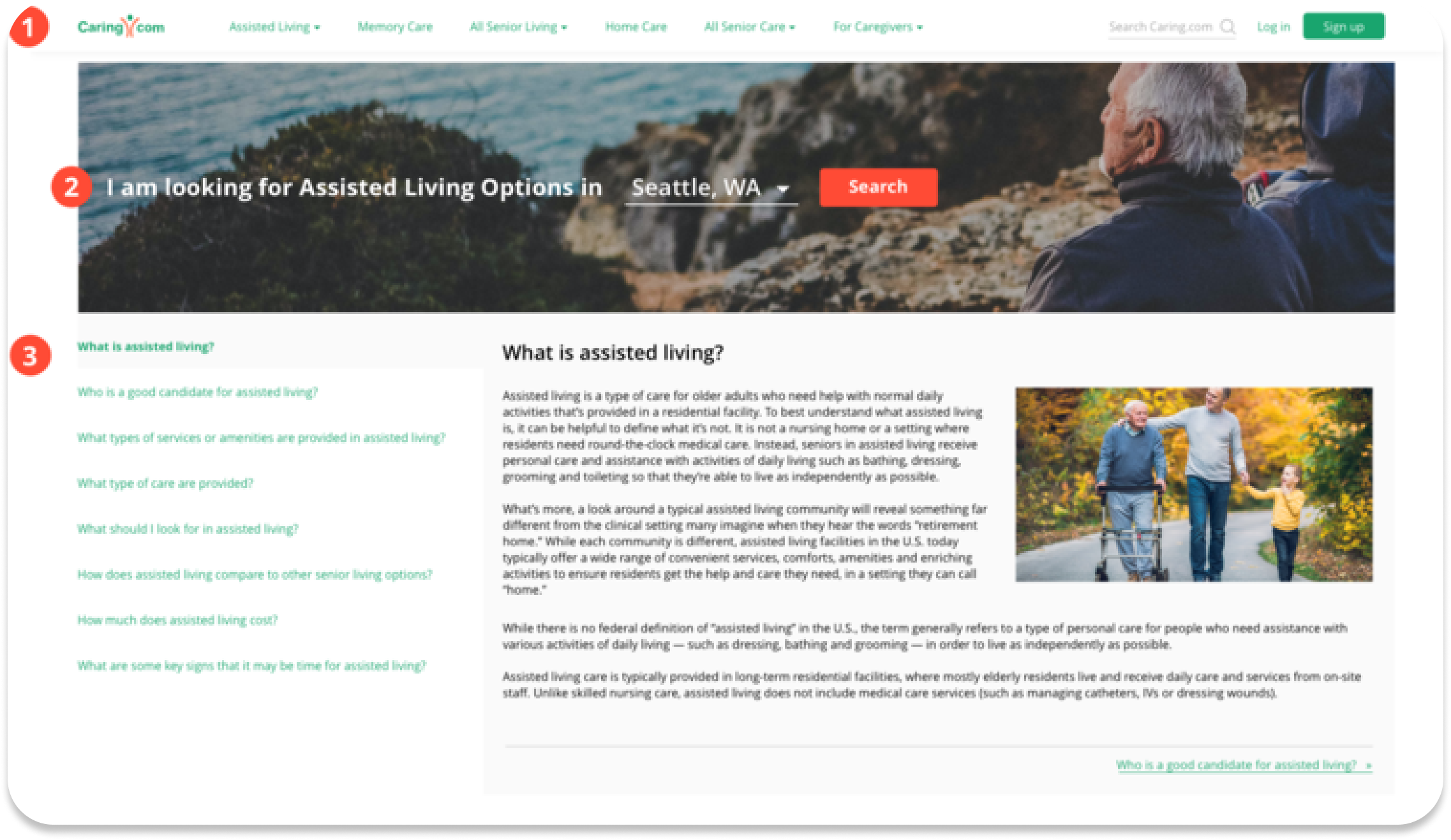
Before screenshot of the Assisted Living webpage
Before screenshot of Caring.com’s information content
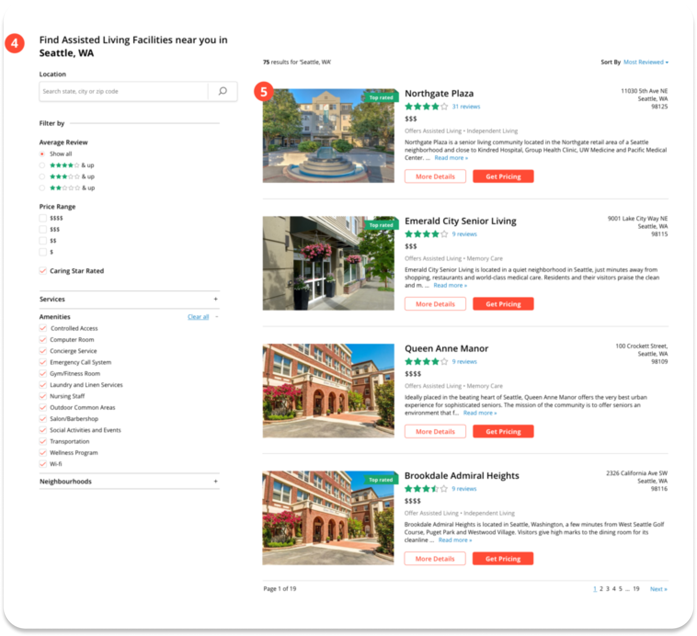
Before screenshot of Caring’s search feature
ASSISTED LIVING: DESKTOP REDESIGN
1. Navigation Bar
Utilized the screen real estate to allow more important content to be visible without having to scroll. Adding a 'Log In' and 'Sign Up' button in the navigation to make it more convenient for users to access the website. Placing these buttons as a solid button will increase the visibility and conversion rate.
Overall, these changes help to improve the user experience by making it easier to access and use the website, and also can increase the conversion rate by making it more visible.
2. Hero image
Including an autocomplete feature for the city/state search field to make it easier for users to find the information they need and reduce the likelihood of errors. In case of similar city names but located in different states, I provided a dropdown option for users to select the correct city/state.
This added feature will improve the accuracy and efficiency of searching and can provide a better experience for the user.
3. Information content
I aimed to present the same amount of information in a manner that reduces the need for scrolling and makes it easier for users to navigate. To achieve this, I kept important content visible above the fold and enabled users to navigate using tabs on the left or links at the bottom of each section.
Mimicking an index in a book, this helps users to easily access the information they need without the need for continuous scrolling.
4. Search filters
I also added filter options such as average review ratings, price range, amenities and neighborhoods to the design, which allows users to quickly filter out options that do not meet their preferences.
This feature helps to save time and makes the search process more efficient and user-friendly.
5. Search results
I added a price range icon as well as an "Offers" label to make it easy for users to see which facilities offer additional care options. To enhance this user-centric design, I also took into consideration the fact that people tend to process information from left to right, when I was positioning these elements.
Users can easily then identify the information they need and understand what additional options are available to them. This increase the usability and it allows users to make more informed decisions.
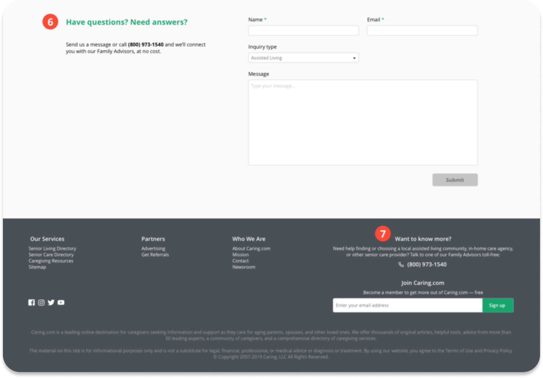
6. Contact form
I also included an "inquiry type" dropdown on the contact form, which changes based on the page the user is currently viewing. Using this as a data end-point, this will allow the business to see where the majority of their users are coming from. This information can used for data analysis to inform iterations, marketing and other strategies.
Additionally, by knowing the specific inquiry type of the user, Caring.com can better tailor the customer service and support to meet user's needs.
7. Footer info
I included the phone number and a sign-up option for Caring.com to make it easy for users to get in touch, no matter which page they are on.
By adding these elements in the footer it makes it easy for users to access important information and make conversions.
ASSISTED LIVING: MOBILE REDESIGN
1. Navigation bar
Most people are right-handed and may often use their mobiles with one hand so moving the hamburger menu and search icon to the right allows users to access them conveniently and comfortably.
2. Information drop down
Rather than having all the content shown on the page and users would have to scroll continuously on mobile, I decided to change the secondary navigation into a dropdown list. That way, the dropdown is always above the fold and users are able to easily navigate from section to section without having to scroll too much.
3. Buttons
For mobile, I made the buttons stretch across the width of the screen with a comfortable padding dimension around it. This is so the buttons would be large enough for precise interaction and would reduce the amount of any misclicks that may happen.
Reflections
LEARNINGS
Through this challenge, I approached it as a design sprint since I felt it would be an effective method due to the time constraint I had. If I could have done this again without any constraints, I would prefer to have spoken with actual users of Caring.com and hear their personal experiences. A comprehensive competitive analysis would have also been a great method to see how competitors are approaching similar problems and evaluate their designs.
WHAT I’D DO NEXT
Although I had the interviewees try my click-through prototypes, the next steps would be to quantitatively test my designs using tools such as heat mapping, web analytics, surveys and usability testing to help validate my design decisions.

